As mobile and social media takes on an ever-increasing role in MBA enrollment marketing, the need for MBA programs to refocus on their website presence only grows. In a recent study by the Graduate Management Admissions Council (GMAC) profiling more than 10,000 global candidates, school websites were still the number one source of information when narrowing down their short list of programs. Yet many sites still include too little or too much information with no clear path to generate new prospects.
Understanding the Decision Making Process of Prospective MBAs
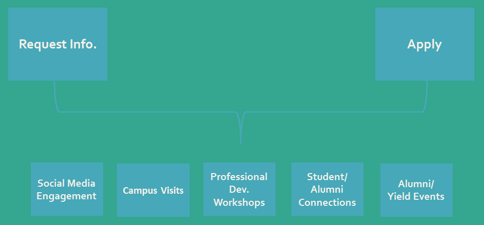
“Request Info” and “Apply.” Two of the most common calls-to-action on MBA program websites. However what they don’t take into account is the other possible touchpoints and opportunities for engagement that happen during a typical MBA admissions cycle. One is tailored to those very early in the process and the other when they’re ready to formally apply leaving an incredibly wide spectrum in between.

Consider the parallels between pursuing a MBA and buying a Tesla Model S. You typically wouldn’t buy the car for $100K+ after only requesting information online. You would want visit the dealership, speak with a subject matter expert who is familiar with the vehicle, take the car for a test drive, ask about the warranty, etc. The same holds true for MBA programs. To drive engagement with prospective students, you need to provide multiple opportunities for them to experience and “test drive” your program.

Determining the Right Mix of Content
Think about your website through the lens of a prospective MBA student. What information do they need and when do they need it? As tempting as it is to see your website like a 30-page interactive MBA admissions view book, to be successful with lead capture you need to find a balance between providing enough helpful content and overwhelming visitors with links, videos, and pictures.
Spend some time looking at the homepage for your MBA program. Where do your eyes go as you scan the page? Is there particular information you want people to see and if so, does your layout and design guide them in that direction? There is a concept of “psychology of space” that is typically applied to architecture and landscape design, but can also be applied to websites and printed materials. The key is to allow people to navigate your space based on common cognitive behaviors.
Here it can be helpful to conduct internal focus groups with newly admitted students so you can get a sense of what information was most/least important to them as they evaluated different programs. You can also identify specific tasks and ask them to talk through their thought process as they navigate your site while a staff member takes notes. This can be invaluable when trying to understand the “customer experience.”
Optimizing Your MBA Program Website for Conversions
When we work with MBA programs, we start by creating a roadmap for the entire customer journey including the website and possible roadblocks to conversion. From there, we identify key touchpoints and the most relevant content and calls-to-action based on where they are in the decision making process.
For example when sharing information about student life, you could offer to connect them with current students so they could ask questions and hear their perspectives firsthand. Doing so is not only a great way to create opportunities for personal connections that just aren’t possible from content and videos on a webpage, but it also gives you another chance to engage your current students in the success of the program which can be invaluable.
Millenials and Gen Z strive to build deep connections. As such, each page should focus on calls-to-action that encompass a number of evaluative dimensions (ex. visit campus, attend an event, connect with a student, participate in a chat, etc.) and be formatted in a way that makes them a focal point for visitors.
Why MBA Program Websites are Still Crucial
You can invest countless hours and budget on Facebook, Snapchat, blog posts, and video content but ultimately if your website doesn’t convert, MBA enrollment marketing will be ineffective. “Request Info” and “Apply” might have been enough in the past, but not for today’s always-on prospective students who are looking for opportunities to engage with your MBA program. The GMAC survey on prospective MBA students serves as a helpful reminder of just how important school websites continue to be, outweighing interactions with admissions staff, friends and family, and rankings publications.
